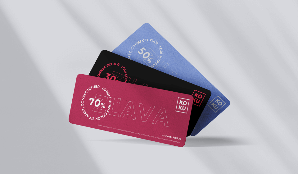
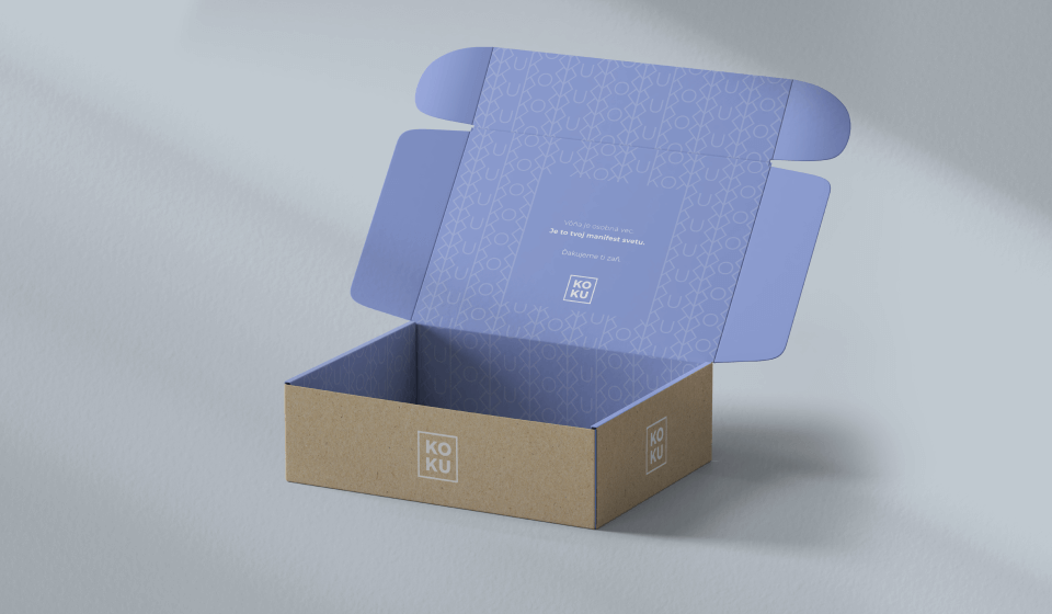
Introduction
A new Slovak e-shop selling brand and niche perfumes and make-up products with a systematic plan to expand abroad. As a newly-established business, the client realized the need to create and build a brand. Introducing KOKU, a fully future-proof brand.


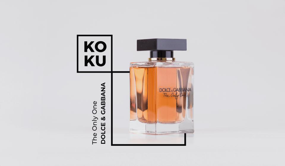
 Main logo version
Assignment
A five-word assignment „„turn KOKU into a brand" was all we needed.

Our approach
Since the start, we wanted to turn KOKU into a sustainable brand. Promising, value-based and strong. A brand that has already started dealing with potential future problems and changes, such as:
A. Market: Gender balance in the beauty industry
The perception that beauty products and perfumes are a predominantly feminine industry has been changing. More and more men use various cosmetic products. This is just one of the obvious transformations. That’s why our identity design is not typically feminine. It’s unisex and adaptive. Ready for market transformations.

B. Internal environment:
Business model development
KOKU’s internal business strategy may evolve together with the market. It may expand its product portfolio with brand new categories. New product lines may be created under a separate brand. The company may expand to other continents. And we will be ready for all these „„mays". We already are.

C. Consumer behaviour: The level of an individual
Scent is a personal matter. It’s our manifesto towards the world. That’s one of the reasons why we reached deep into details to create a complex branding solution. On the level of an individual. We have embedded respect towards individuality directly into the brand’s DNA. We have created an identity which is not static. It evolves in time. It adapts to its target audience and tries to understand them.
D. Social responsibility: Sustainability in practice
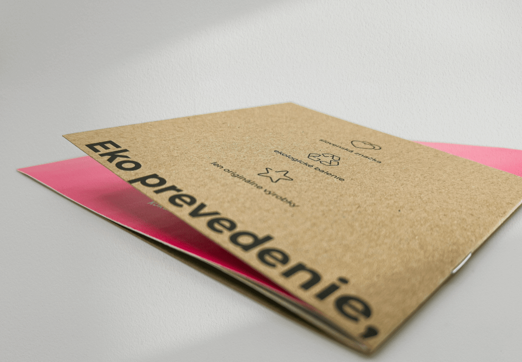
Creating a brand with the largest possible impact on customers’ lives and the smallest possible impact on the environment. We worked with this idea of social responsibility and sustainability when creating the Brand Manual, packaging materials and offline outputs.
Solution
A strong DNA, clear vision and mission, long-term goals, tonality and values. These are the foundations that KOKU’s original visual identity was based on.
This was followed by packaging and all offline materials needed to start launch the e-shop.
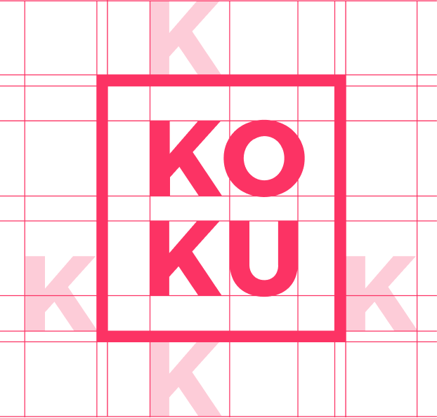 Main logo protection area
Colours
With the right colour mix, we can express any emotion for any target group and any product.
Typography
The difference in the primary and secondary font and their mutual contrast help make the brand’s typography memorable.

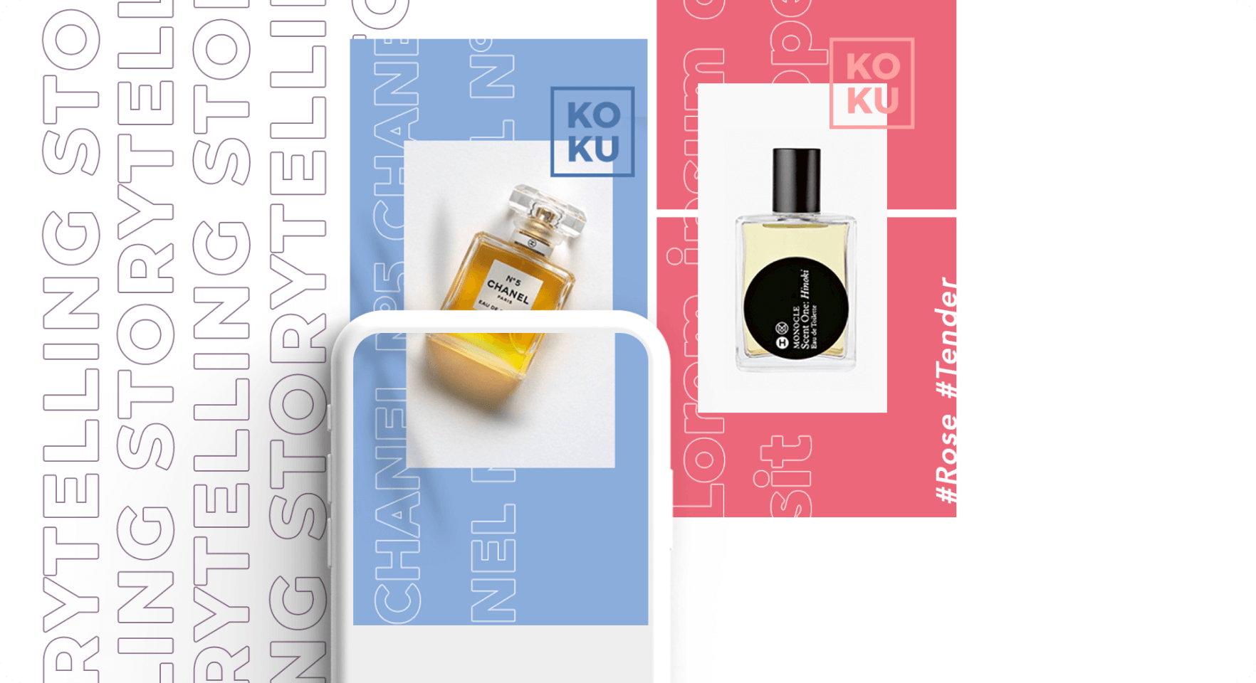
Visuals
Colours and fonts are not enough to create a unique visual identity.
That’s why we created a complex visual identity which is original and flexible to use.
The Haiku principle in content
Haiku is a Japanese poetry genre.
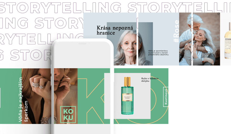
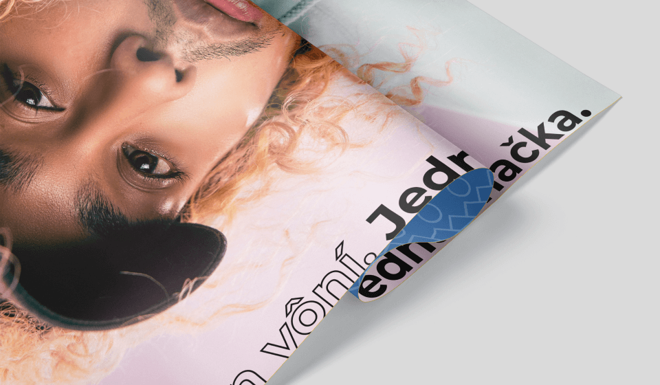
Haiku brilliantly describes a single moment in 3 verses. We took this principle and incorporated it not only in copywriting, but also in KOKU’s visuals and photographs. We used lyrical haiku as an inspiration and transformed its principles into graphic design. Our visual haiku presents an image of a real situation, an emotion of a real but fleeting moment.
Sea breeze, flower aroma, vanilla flavour. Breathe in freedom and breathe out all your worries.
Portfolio
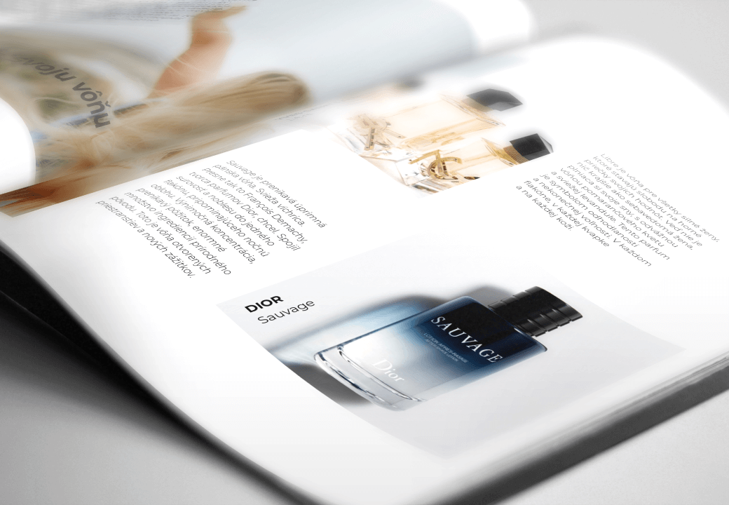
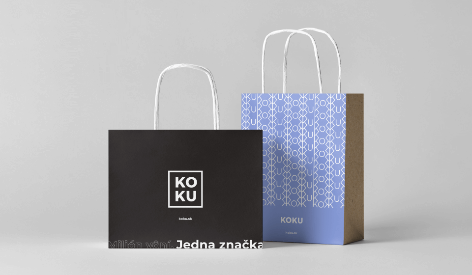
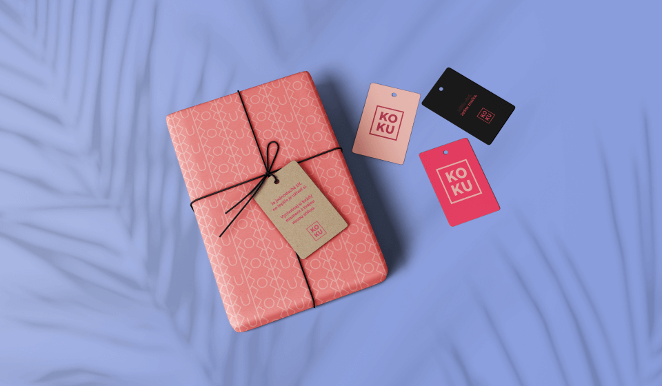
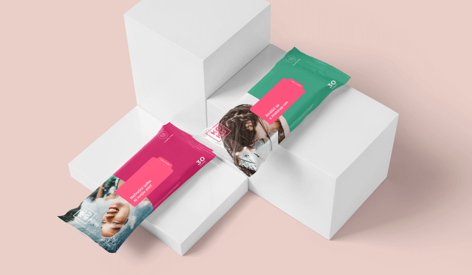
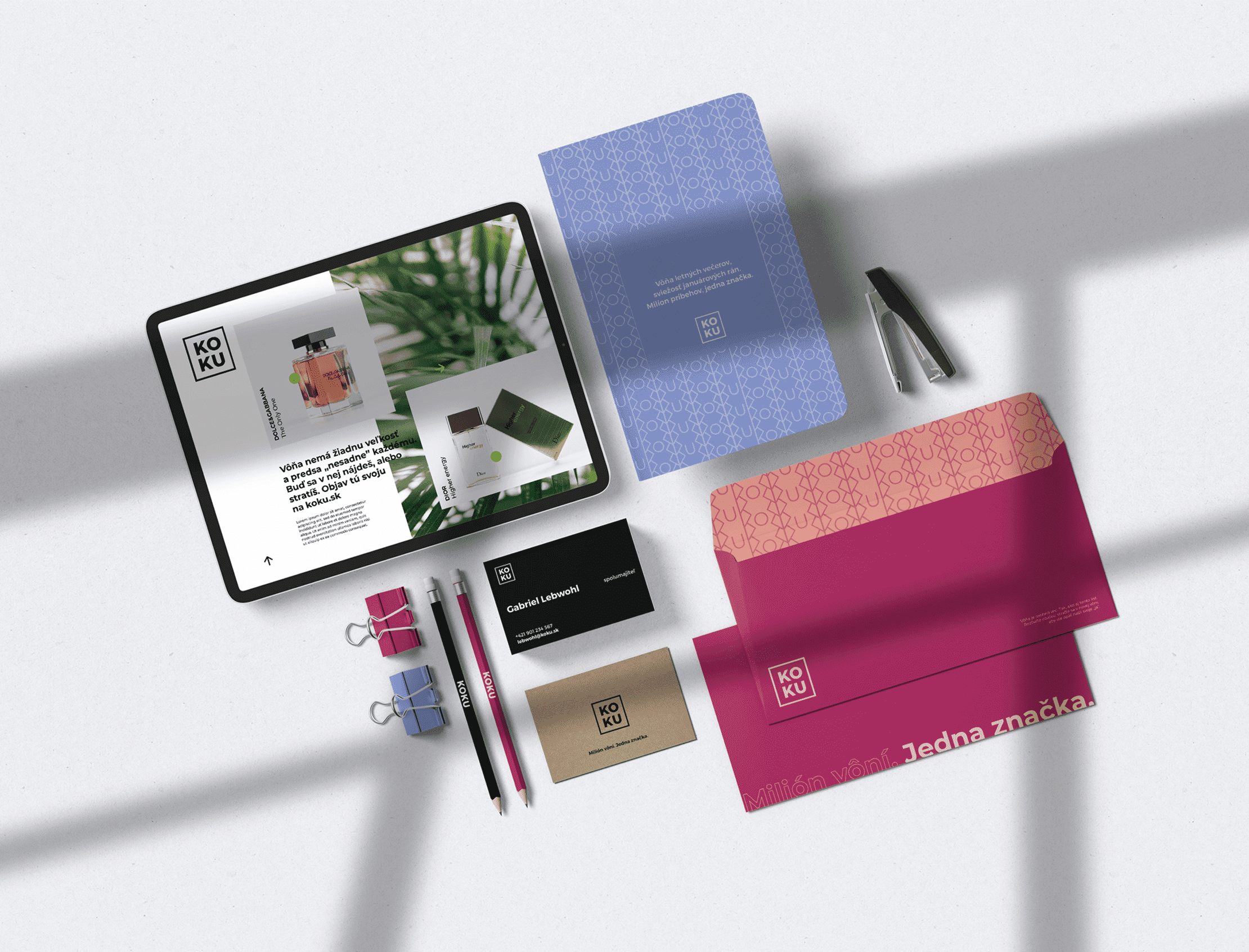
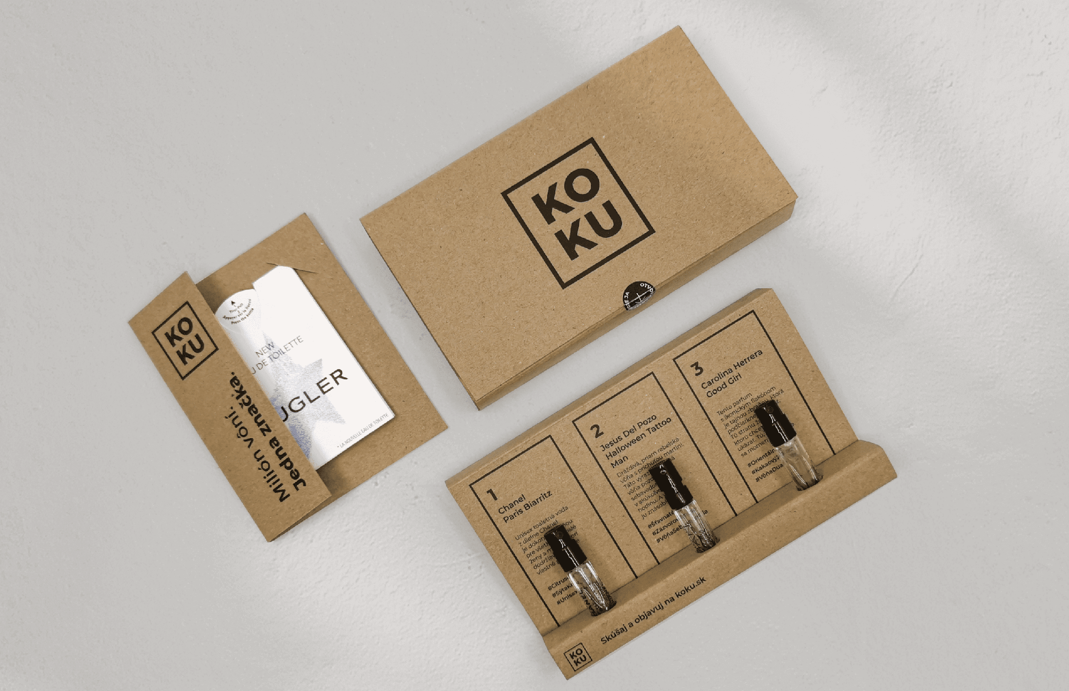
We breathed new life into identity. Adventurous and eco-friendly. A well-defined brand identity – including visual identity – was transformed into tangible outputs. We designed full business correspondence, all packaging materials and innovative ,,Discovery Sets" with perfume testers. And there’s more.

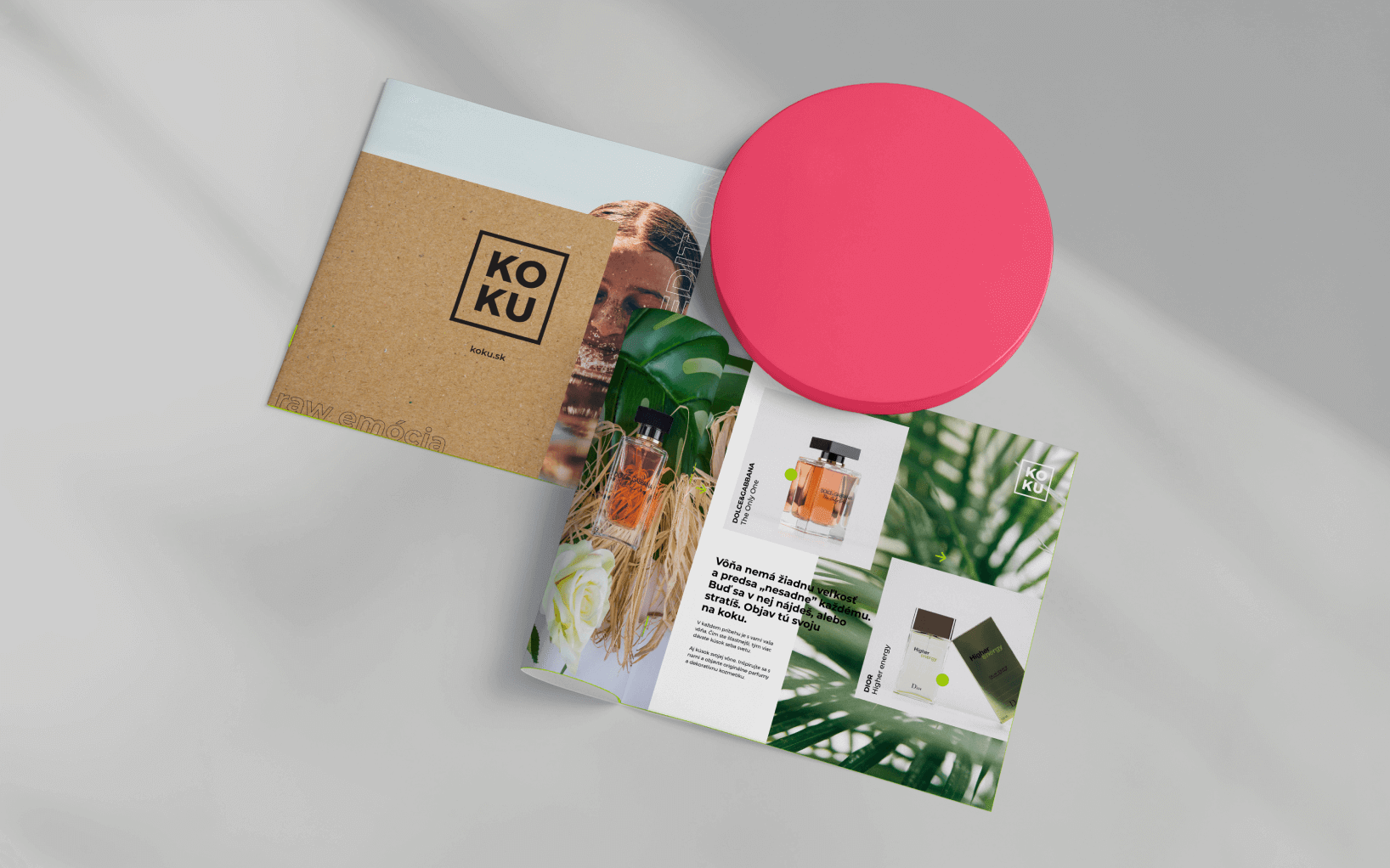
Eco promise in practice
We care about the environment. This reflects on our actions. That’s why offline outputs were made from recycled materials. We also ask our customers to pass them on instead of throwing them away.
Summary
We have turned a new business into a brand. With nature and individualism in mind, we have transformed a Slovak e-shop into a lifestyle brand which unites and never divides.
- branding
- brand strategy
- packaging
- social network management
- marketing consulting
Boomex is a young highly-skilled team which clearly understood our needs, objectives and in particular the kind of brand we want KOKU to be. I can honestly say that they far exceeded our expectations, and they still do. Long-term cooperation with this company is more than certain.
Collaboration under the sign of Dior, which also includes a worldwide award-winning website. Read more →
With the strategic concept of the comfort zone, we have presented Lakeside Park with a long-term marketing vision. Read more →
Even for an international brand, it is effective to communicate locally. Even in soc. networks. Read more →
something similar?
Contact us
