Intro
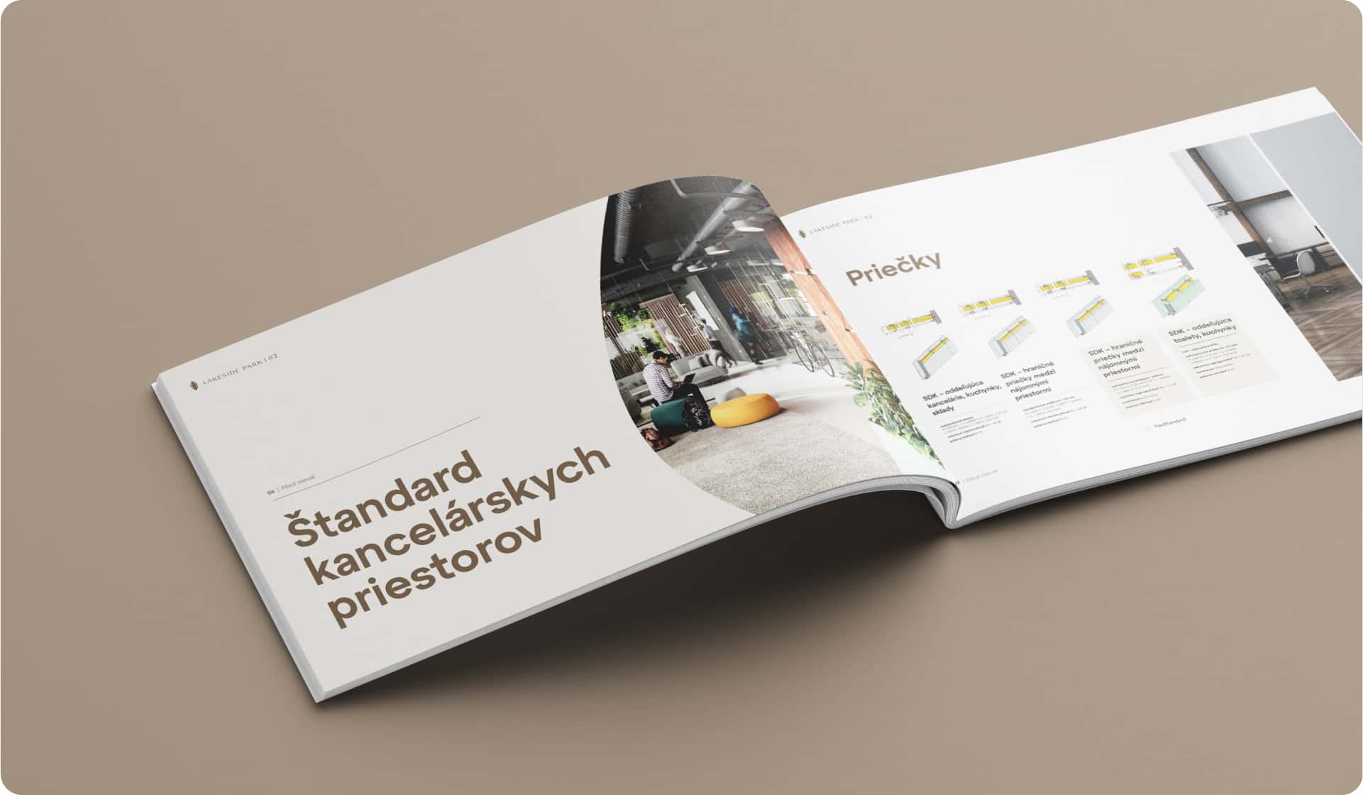
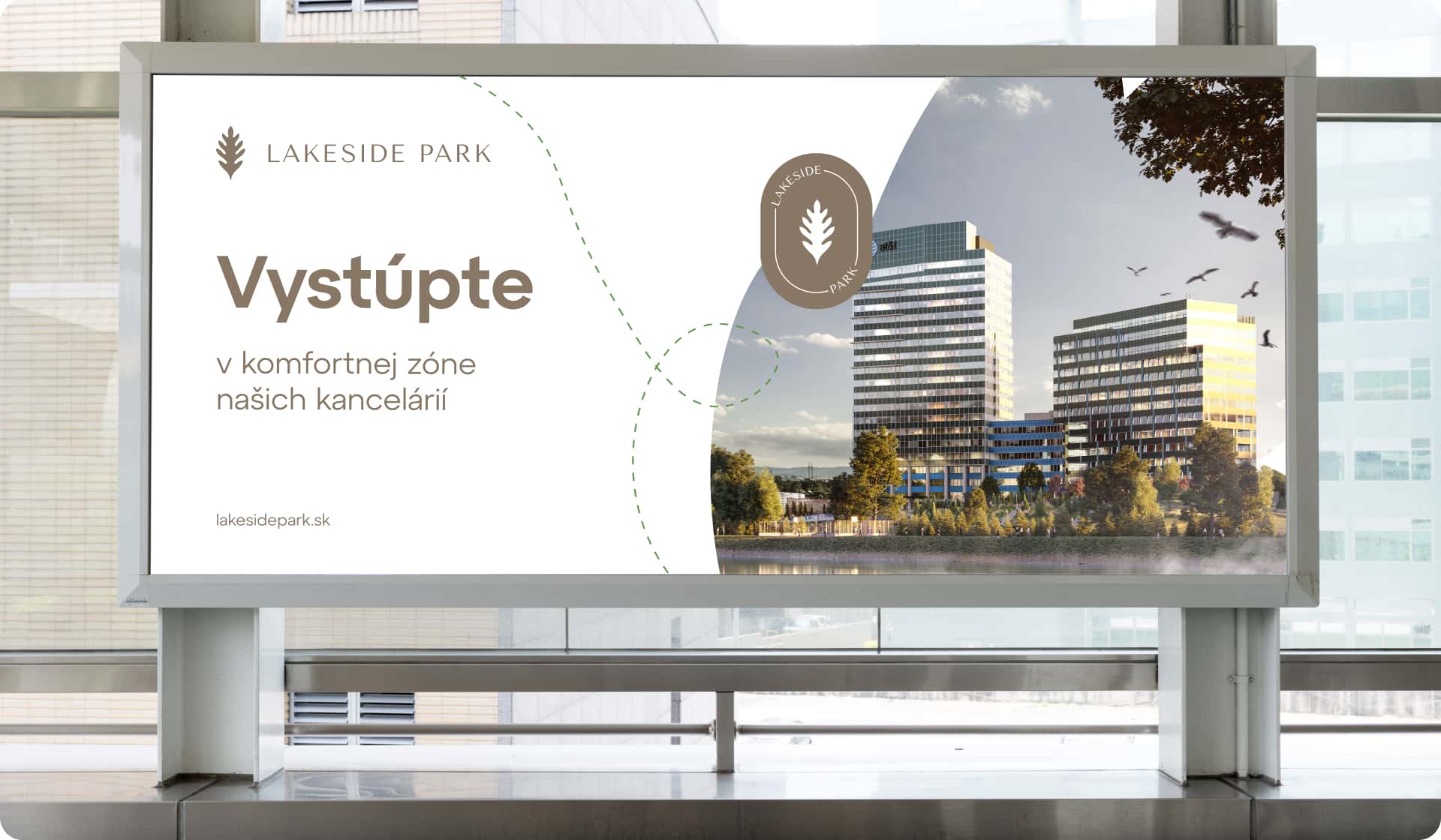
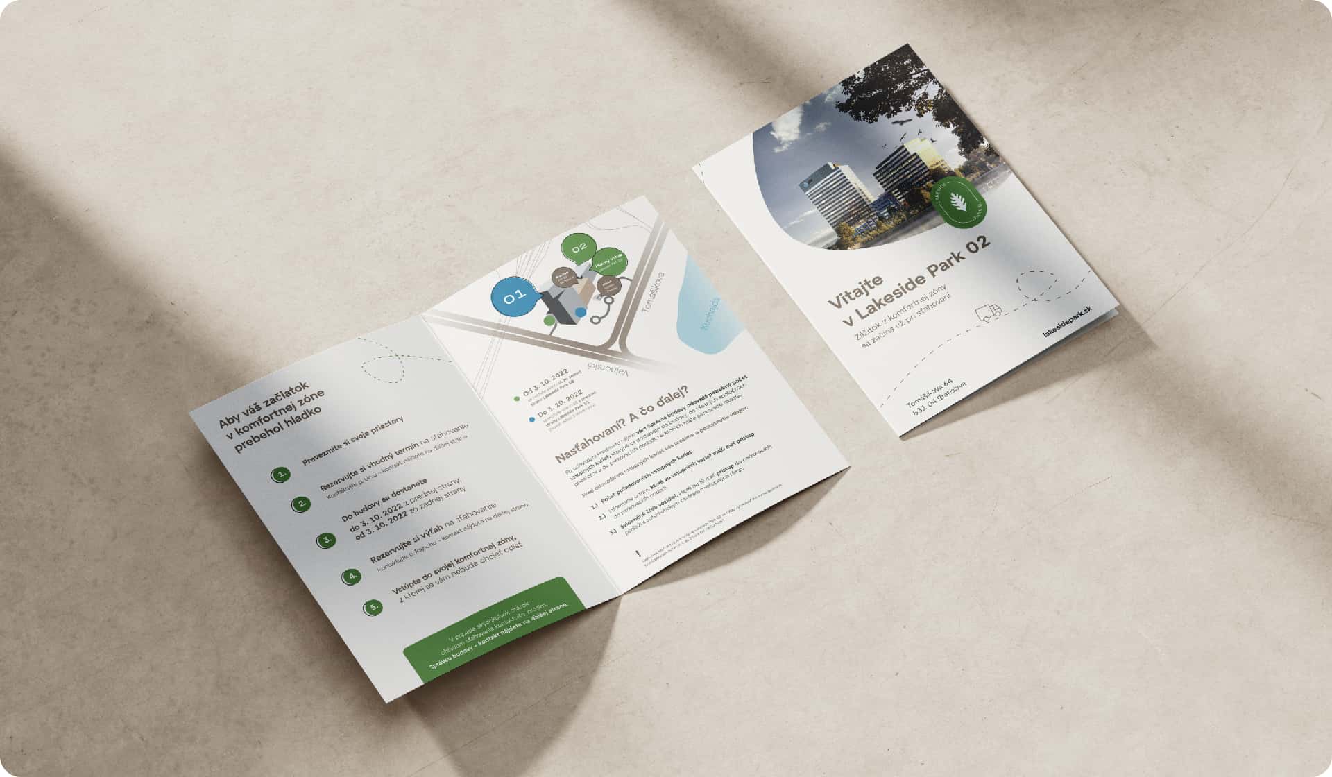
Lakeside Park is a business centre complex in Bratislava's Nové Mesto district by Kuchajda Lake. With the second phase of the project, Lakeside Park 02, co-developed by WOOD & Company Real Estate and IMMOCAP, we prepared a vision for the office building complex and revamped its visuals – both online and offline.

Brief
Our primary task was to help the expanding Lakeside Park brand with its identity and by doing so, to actively support the leasing team in renting the office space.
The aim was to achieve expected results before the completion of the construction of the new part of the project.
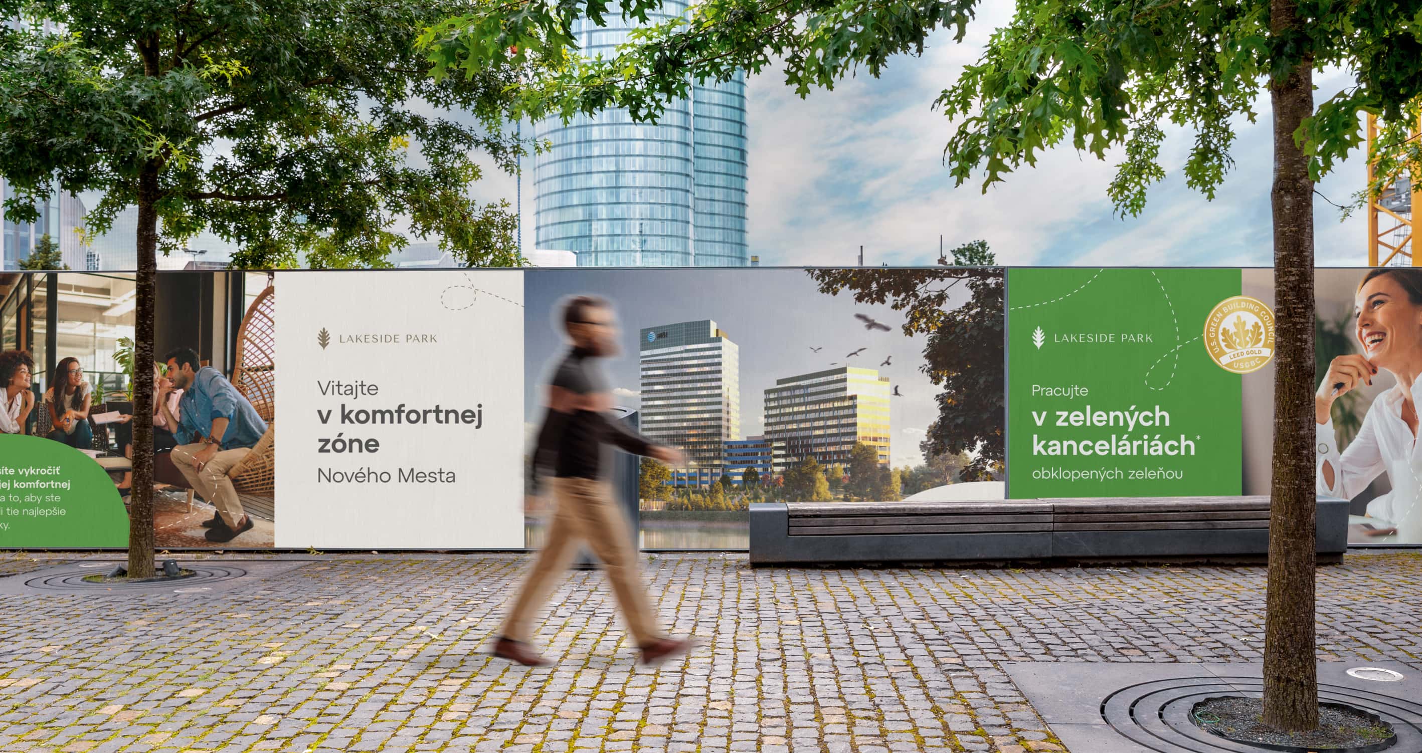
Our approach
We didn't just focus on reimagining the visual identity. First and foremost, we wanted to create a concept that would serve as a long-term strategic guide and convey a strong brand story that speaks for itself.
We turned an office „„island" into a comfort zone, Lakeside Park.


Solution
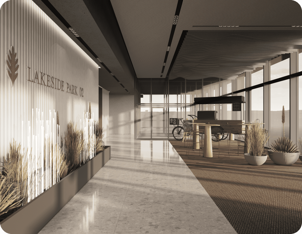
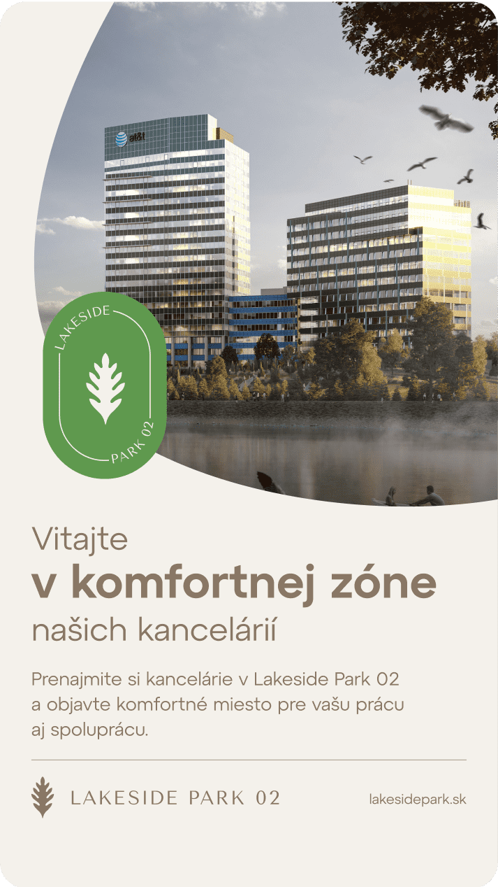
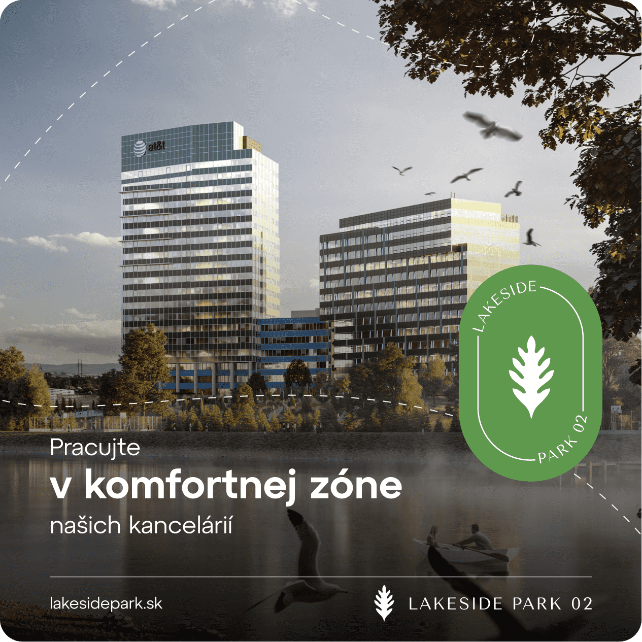
We've created the concept of a comfort zone which you don't even have to leave to achieve the best results. We believed that the right results come when you can fully focus on your work instead of dealing with day-to-day problems.
Only a comfortable work environment leads to long-term performance. Lakeside Park will help you strike the right balance between work and relax without any stress or hustle. Welcome to your comfort zone. Welcome to Lakeside Park.
This concept aims to change the stereotypical mindset that „„only hustle leads to results" and only results achieved under stress, chaos or haste, outside our comfort zone, are really worth it. Because that's simply not true. The comfort zone represents a long-term concept solution that is easy to understand and applicable (not only) to leasing and property management.
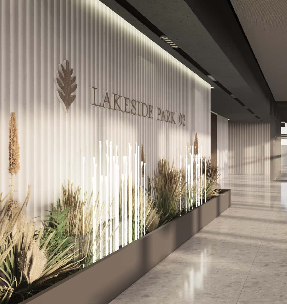

Rebranding
Then we proceeded to the rebranding stage. Our intention was to create a visual identity that would capture the essence of the project and promote a healthy and eco-friendly lifestyle. And last but not least, that would pave the way for the second phase.
We based the rebranding on the concept of a comfort zone. Comfort became part of the reshaped logo, the cosy colour palette and flexible visual elements. As a result, the rebranding actively contributes to a pleasant experience of the office buildings.

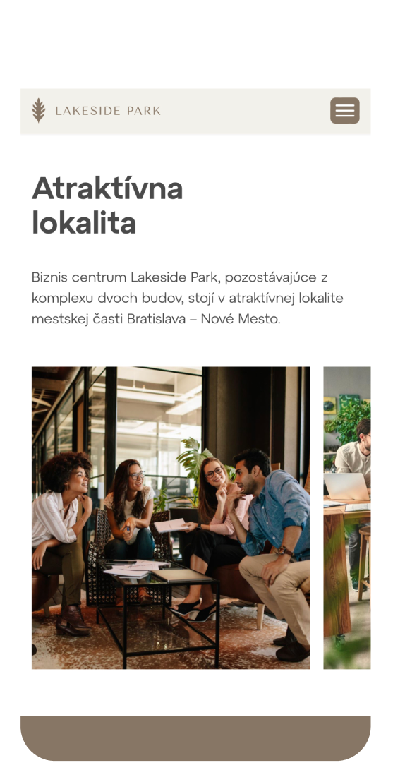
Comfortable website experience
It was important to bring all the information about both phases of Lakeside Park together into one place and make it easy for prospective tenants to contact the leasing team. The website provides visitors with all they need at their fingertips, just like the buildings themselves do. Visitors can get information on the offices of their choice and requirements in a few clicks.
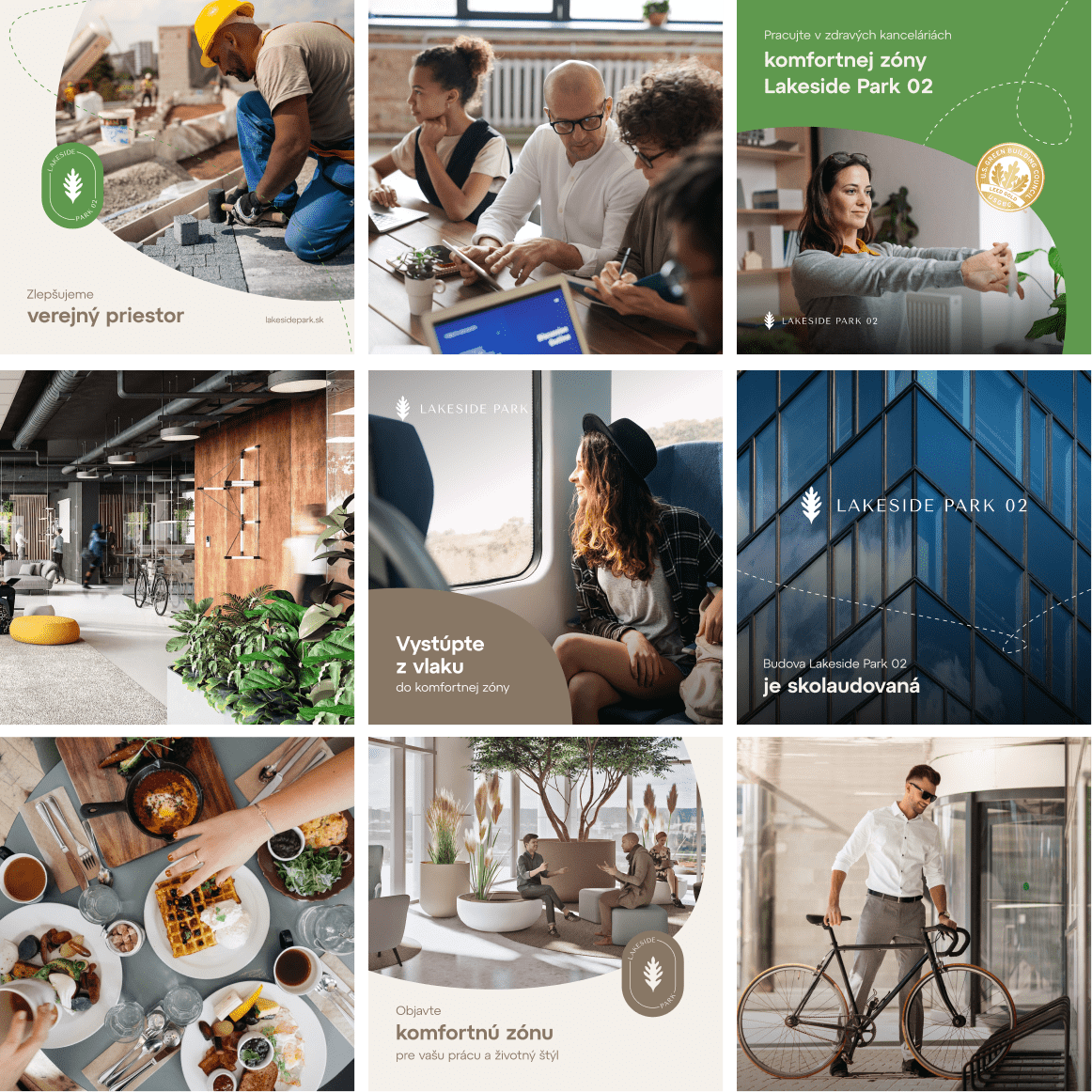
We've made scrolling through social networks more enjoyable
We brought the complex closer to the public through active social media communication, promoting the support provided to tenants and their healthier and more sustainable lifestyle with everything they need at their fingertips. By promoting these topics, we have created a comfort zone for the social media community.
Campaigns that helped rent out the building
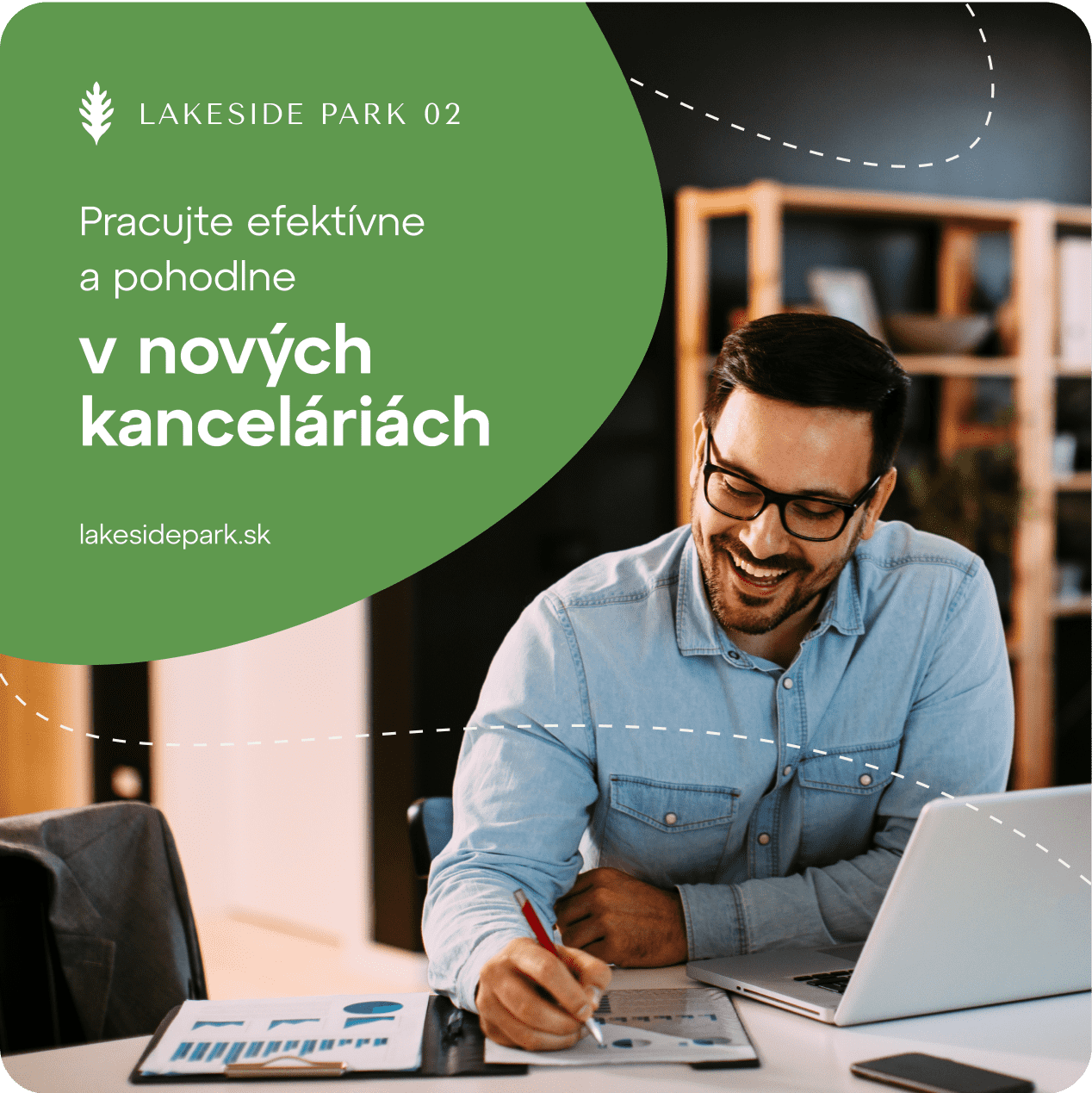
Through a well-chosen marketing mix and campaigns, we generated relevant leads interested in renting the available office space. In cooperation with the leasing team, the building was quickly fully occupied by satisfied tenants.
Summary
With the strategic concept of the comfort zone, we have presented Lakeside Park with a long-term marketing vision. In this way, we provided the building managers with a guide for activities for tenants. We reflected the comfort of the office space into the branding, used social media to reach the public and brought in new tenants thanks to our campaigns.
All elements from pleasant colours, yoga classes to smart building design fits into our comfort zone concept in symbiosis with the lifestyle of the tenants, delivering the desired results for the brand.
- logo
- brand identity
- analysis and strategy
- creative and efficient campaigns
- social media communication
- website development
- performance marketing
The construction of the second phase of the Lakeside Park project brought both the need and the opportunity to take another creative look at the branding of Lakeside Park and to consider the real brand context, as the first part of the complex has been in operation for several years. Boomex understood the key parameters and feel of the building very well and brought the comfort zone concept to the office concept space. Once it was approved, they modified the logo, the overall branding, and helped us set a new tone of communication based on the values we deliver to our clients on a daily basis.
The B2B campaign brought the brand closer to entrepreneurs who live in places where it does not have a branch. Read more →
We have transformed the new e-shop into a lifestyle brand, fully prepared for the future. Read more →
Even for an international brand, it is effective to communicate locally. Even in soc. networks. Read more →
something similar?
Contact us
